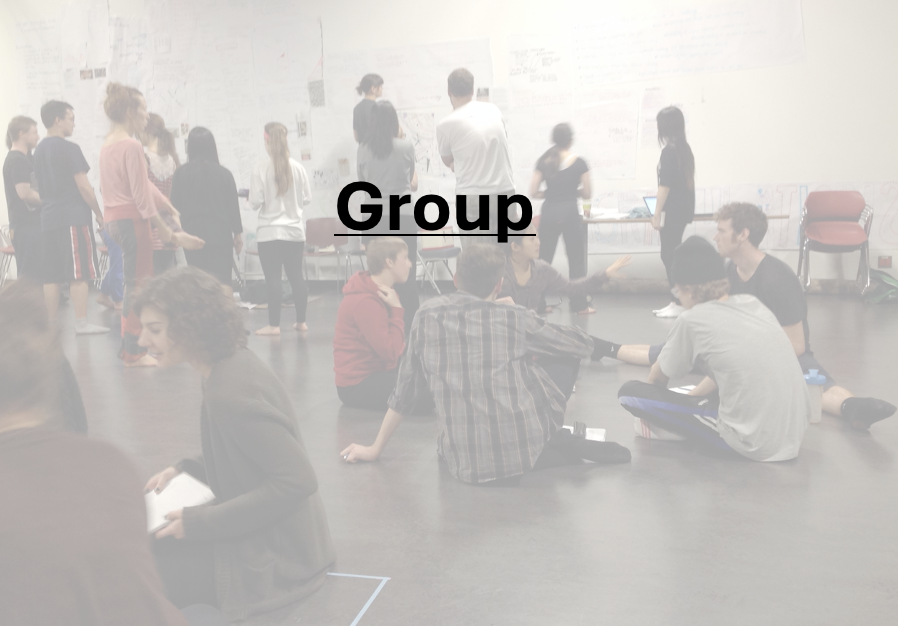
Gestalt︎︎︎
Gestalt Theory in Design
In the simplest terms, gestalt theory is based on the idea that the human brain will attempt to simplify and organize complex images or designs that consist of many elements, by subconsciously arranging the parts into an organized system that creates a whole, rather than just a series of disparate elements. Our brains are built to see structure and patterns in order for us to better understand the environment that we’re living in.
As with any psychological principle, learning to incorporate the visual perception principles of gestalt into your design work can greatly improve the user experience. Understanding how the human brain works and then exploiting a person’s natural tendencies creates a more seamless interaction that makes a user feel comfortable on a website, even if it’s their first visit.
Gestalt laws are relatively easy to incorporate into just about any design and can quickly elevate a design that seems haphazard or like it’s fighting for a user’s attention to one that offers a seamless, natural interaction that guides users toward the action you want them to take.
Similarity
It’s human nature to group like things together. In gestalt, similar elements are visually grouped, regardless of their proximity to each other. They can be grouped by color, shape, or size. Similarity can be used to tie together elements that might not be right next to each other in a design.

Continuation
The law of continuity posits that the human eye will follow the smoothest path when viewing lines, regardless of how the lines were actually drawn.
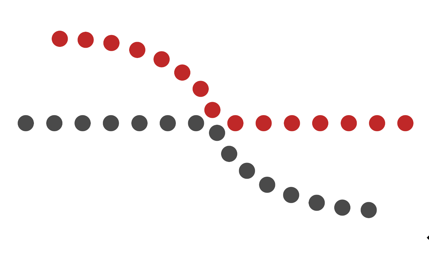
Closure
It’s the idea that your brain will fill in the missing parts of a design or image to create a whole. In its simplest form, the principle of closure allows your eye to follow something like a dotted line to its end. But more complex applications are often seen in logos, like that for the World Wildlife Fund.

Proximity
Proximity refers to how close elements are to one another. The strongest proximity relationships are those between overlapping subjects, but just grouping objects into a single area can also have a strong proximity effect.
The opposite is also true, of course. By putting space between elements, you can add separation even when their other characteristics are the same.

Figure/Ground
The figure/ground principal is similar to the closure principle in that it takes advantage of the way the brain processes negative space. You’ve probably seen examples of this principle floating around in memes on social media, or as part of logos (like the FedEx logo already mentioned).
Your brain will distinguish between the objects it considers to be in the foreground of an image (the figure, or focal point) and the background (the area on which the figures rest). Where things get interesting is when the foreground and background actually contain two distinct images...

Symmetry and Order
The law of symmetry and order is also known as prägnanz, the German word for “good figure.” What this principle says is that your brain will perceive ambiguous shapes in as simple a manner as possible. For example, a monochrome version of the Olympic logo is seen as a series of overlapping circles rather than a collection of curved lines.

Common Fate
While common fate was not originally included in gestalt theory, it has since been added. In UX design, its usefulness can’t be overlooked. This principle states that people will group together things that point to or are moving in the same direction.
In nature, we see this in things like flocks of birds or schools of fish. They are made up of a bunch of individual elements, but because they move seemingly as one, our brains group them together and consider them a single stimulus.

︎︎︎from
Topal Designs
Welcome to mapping collaboration, a toolbox for workshopping and creating across disciplines...
In spite of a long history of interdisciplinary creation, from our earliest recorded arts to our present moment, artistic pedagogy has created divisions between disciplines. This has left artists in a "post-Babel" condition where we don't share the same language and definitions. It’s also encouraged artists to develop practices for devising, creating and composing work that are distinct to their disciplines.
In spite of a long history of interdisciplinary creation, from our earliest recorded arts to our present moment, artistic pedagogy has created divisions between disciplines. This has left artists in a "post-Babel" condition where we don't share the same language and definitions. It’s also encouraged artists to develop practices for devising, creating and composing work that are distinct to their disciplines.
The inspiration for this project came from faculty and students at Simon Fraser University’s School for the Contemporary Arts where BFA, MFA and PhD programs in Dance, Theatre Production and Design, Visual Art, Film, and Music and Sound all work together in studio settings and playfully experiment with processes of art-making.
We wanted to create a database of projects, assignments and theory that we collect inside the studio and from research happening in other places. We are curious about how we collaborate and how structures reoccur, translate and deviate from one discipline to another.
Composition is central to these processes and offers a base for our approaches and experiments. We are excited about what our students are doing and inspired by the new languages in contemporary art and performance we continue to see develop.
︎︎︎select a category above to build assignments, learn more about how artists process ideas across disciplines and to create a collaborative process of your own
︎︎︎these tools are collected and used in workshops and classes; some are resources from artists; some are quotes about art-making and how bodies think and listen; others are ideas to expand and disrupt your own training and processes.
︎︎︎Each idea is intentially short- and not meant to be executed as written, but to be adapted to your own practice and specific project/context. Some may be taken in parts or combined with others to spark new ways of training and making together.
︎︎︎submit your own ideas and tools so we can keep building this site!